

In an era where over half of global website traffic comes from mobile devices, having a mobile-first WordPress site is no longer optional; it’s essential. As we gear up for 2024, the focus on mobile-first design is sharper than ever, ensuring that websites are not only responsive but also optimized primarily for mobile users. This guide provides a comprehensive look at the best themes, plugins, and design tips for creating a mobile-first WordPress site that delivers both performance and enhanced user experience.
Why Mobile-First?
The mobile-first approach involves designing an online experience for mobile before designing it for desktop or any other device. This paradigm shift is driven by the need to cater to the increasing number of users who access the internet via smartphones and tablets. Websites designed with a mobile-first philosophy prioritize loading speed, navigation efficiency, and touch interactions, which significantly improve user engagement and satisfaction.
Top Mobile-First WordPress Themes for 2024
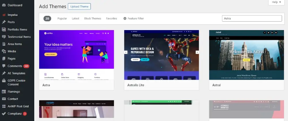
- Astra: A lightweight and customizable theme that’s built with a mobile-first approach. Astra is known for its speed and simplicity, making it a favorite among WordPress developers looking to optimize for mobile users.
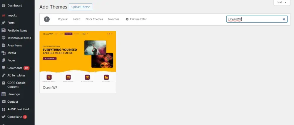
- OceanWP: This theme is flexible and fully responsive, with a variety of demos that cater to different industries. OceanWP supports WooCommerce integration perfectly, making it ideal for mobile-first eCommerce websites.
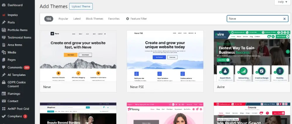
- Neve: Neve is a super fast, easily customizable, multi-purpose theme. It’s AMP-compatible, which means it loads instantly on mobile devices, enhancing the user experience and boosting SEO.
Choosing a mobile-first theme is the foundation of building a mobile-optimized site. These themes are designed to ensure that content looks great and functions flawlessly across all mobile devices.
Essential Plugins for Mobile-First Sites
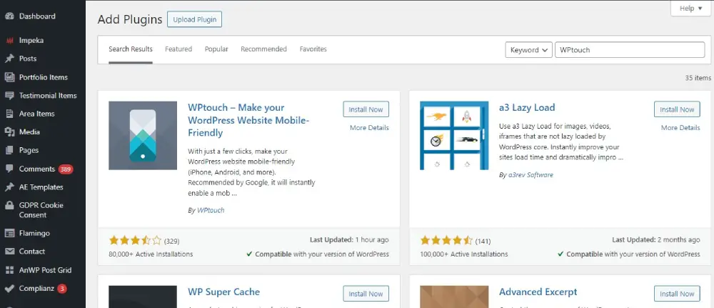
- WPtouch: This plugin automatically adds a simple and elegant mobile theme for mobile visitors to your WordPress website. It allows for quick setup and customization without affecting the desktop version of your site.
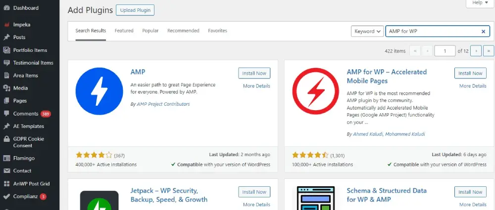
- AMP for WP: Accelerated Mobile Pages (AMP) makes your website load instantly on mobile devices. This plugin helps create mobile-optimized content that can load instantly everywhere.
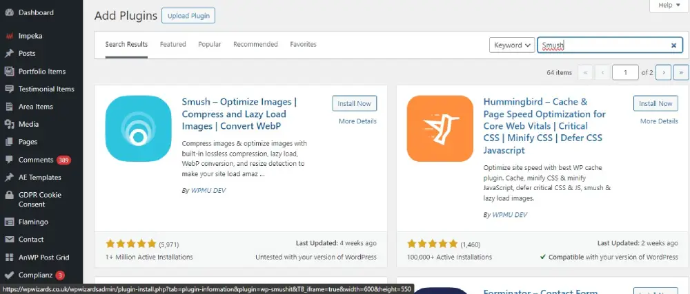
- Smush: Image size affects loading time dramatically. Smush compresses images without losing quality, making your site faster on mobile devices.
Design Tips for Mobile-First Sites
- Streamlined Navigation: Simplify your site’s navigation to make it thumb-friendly. Consider using a hamburger menu to save space and maintain a clean layout.
- Touch-Friendly Design: Ensure all buttons, links, and call-to-action elements are easy to tap. The average adult finger pad size is about 10 mm wide, so design with this in mind.
- Optimize Media: Use responsive images and videos that adjust to different screen sizes and orientations. Always prioritize content that loads quickly and doesn’t consume too much mobile data.
- Prioritize Above-The-Fold Content: Place essential information above the fold to engage users immediately without scrolling. This includes your main call to action.
- Test Relentlessly: Use tools like Google’s Mobile-Friendly Test to see how your site looks on different devices and identify areas for improvement.
Conclusion
Creating a mobile-first WordPress site in 2024 means prioritizing the mobile user’s experience in every aspect of design and functionality. By selecting the right themes, employing useful plugins, and applying mobile-first design principles, you can ensure that your WordPress site not only reaches a wider audience but also delivers a satisfying user experience that keeps people coming back. As mobile technology continues to evolve, staying ahead of these trends is crucial for anyone looking to succeed in the digital space.