Do it the easy way; conversion with convenience! Surely SaaS web design takes a lot more consideration than other website designs as you are selling services. As much as the numbers are important in creating a website, there are other factors that are mostly overlooked. Therefore, complaints like “I have invested so much in the designing and yet there is no conversion” arises.
Well, save yourself from the trouble and learn how to design a SaaS website with simple principles that hold an important place throughout the process.
HOW TO DESIGN SAAS WEBSITE
Your website has a critical role when it comes to promoting not only the best image but the best product. Most importantly, when you are offering service as a product. The purpose of every SaaS website is the same.
What is a SaaS website?
Without a tangible product, it is tricky to gain organic traffic and convert them into customers. A SaaS (software as a service) is selling applications as a service – so SaaS websites are solely delivering services in the form of web-based software, hosted software or on-demand software. However, while creating a SaaS site, the strategy varies as per what software as a service you are offering. Therefore, you cannot say one strategy works for all.
SAAS WEBSITE CASE STUDY
Starting off with a SaaS website case study, you will understand how most of the companies completely disregard human behaviour, which leads to “no conversion” despite the investment.
A case study at Conversion Crime tested 10 medium to big software websites with real users talking their first impression about which design or strategy works great.
Websites tested;
- freshbooks.com
- youneedabudget.com
- sugarsync.com
- prestashop.com
- toggl.com
- copper.com
- sendx.io
- hive.com
- gumroad.com
- zapier.com
That is to say, 30 seconds are more than enough for the users to decide if they want to stay or leave.
Speaking of the first impressions, users have had a look at a few elements of a SaaS website design. As a result, these few components of the website are the most important.
Therefore, you have to pay keen attention to what consumers want from a service provider.
Logo:
- Professional
- Depict brand’s vision
- Colours must align to the site
Headline:
- Must tell users what you are offering
- Direct and to the point
- Left aligned
Sub-headline:
- Must follow the headline
- Benefit-oriented
- Shorter the better
Visuals:
- Right alignment
- Descriptive
CTA:
- Must lead them to next step
- Mention free-trials if there are any (as there is no tangible product to try, you must make trust with users with free trials as a test)
Navigation:
- Unlike other sites, a SaaS website must use descriptive labels
- Proper categorization
Testimonials:
- Give users something to trust in
Example:
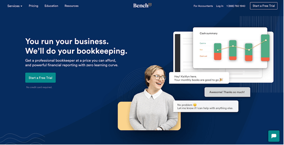
Logo: clean, good contrast
Headline: not as short as it could be, but compelling, descriptive
Sub headline: it gives users more information about the headline
CTA: free-trial (perfection)
SOFTWARE AS A SERVICE WEBSITE DESIGN PRINCIPLES
However the strategy differs from one site to another, there are some basic SaaS website design similarities that every SaaS website must have. For instance;
- The content must engage your potential buyers
- An effective SaaS site must have a demo or free trial. It helps customers build trust.
- It must highlight issues and provide solutions
Let’s get onto basic principles every business must consider while creating a web design to increase conversions.
Value Proposition
There are a lot of companies offering the same services, what makes you stand out amongst customers?
The sole purpose of your business’s value proposition is to tell users what you are offering and why they must choose you.
Following the above-mentioned basic; the headline and sub-headline is the selling point to sum your service or product. Therefore, you must do it the right way.
Make two segments for the headline; firstly tell customers about your service. Secondly, how you are better than others.
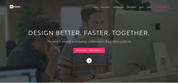
INVISION implements perfection when it comes to a value proposition; powerful and simple. The first segment tells what to do. Whereas, the second segment states why customers must choose you.
Not just tell; show!
People like to know what they are getting and you have to give them what they want. Therefore, adding visuals of the product or services is a must-have for SaaS websites.
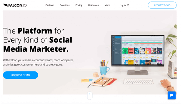
FALCON has made the right use of white space. On the right, they have given an overview of how their product or service interface looks like. That is to say, they have a perfect headline with proper weight to main words. Moreover, the subheadline further explains the headline.
On the top menu, with PLATFORM navigation, they have subcategories that give users a complete tour of what they will be getting. Clean and straightforward.
CTAs
Make them hit the button!
A website with an attractive and compelling call to action button is proved to have higher conversion than the ones that come with a boring “sign up now” CTA.
For the SaaS websites, you must have to give an element of some additional perk your company has to offer. For instance;
- Use of compelling colours.
- Adding words like “Free Trial”, “Hit the button for Demo”, “get your free trial” can make a significant difference.
There is no rule that says you cannot add more than 1 CTA to your website. However, only if it is important and you have something really exciting to offer.
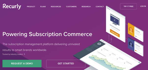
Recurly is using 2 CTAs on their main page. It gives users more edge when it comes to choosing the service. For instance, if you may have heard or have seen what they have to offer, and you directly want to get started. There you go!
Videos
Pictures are better than words, and videos are even better!
In today’s world, people are more interested in seeing rather than spending time reading through the text. Moreover, videos give you an upper hand, specifically when we talk about analytics. It gives you a better idea of what users are looking more into.
But;
Shorter the better! You do not want to scare the visitors with an hour-long video. Get to the main point. Show what you have to offer and what benefits the users will get.
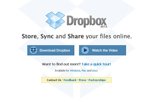
Dropbox knows what they are doing.
An amazing headline, with an explanatory subheadline. Furthermore, 2 CTAs. The first one quickly navigates visitors to the product, and the second CTA offer how it works.
Though it does miss out on a free trial, THAT IS DROPBOX. They know their worth and the consumer need.
Contact Information
Have a Question?
There is no doubt in the fact that having an “easy to find” contact information takes off half the effort. The best practice while creating a SaaS website design, make sure to give customers easy navigation to get in touch, especially on the homepage.
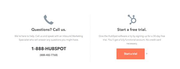
In this example, column layout is used to separately include the two most important SaaS website elements; contact & free trial.
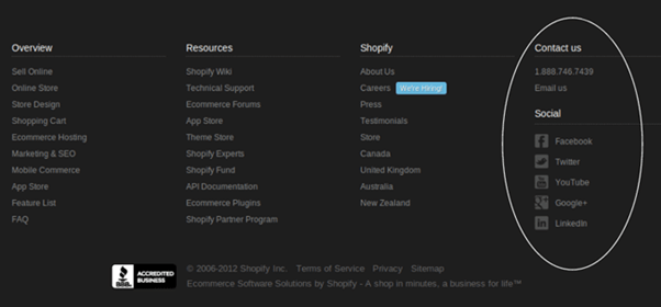
However, Shopify makes it a lot easier for the users to find them – on the homepage. The less users have to navigate, the better it is.
Do Not Miss Out on The Demo
What if the customer needs to try your product out without going through the whole technical part?
Demo, demo!
The best-served demos are the ones that are offered right on the front. Moreover, it let the customers know there is a demo before they decide to leave the site. That is to say, make it stand out on the homepage, simple and clear.
Once they are on the demo, do not forget to give them a reminder to sign up for free. This way you are achieving two purposes with one click. Moreover, this is the best practice most SaaS companies use – and the competition is tough.
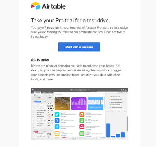
In the above-mentioned example, the company is offering a free trial with a template. It is more than enough to use that template and see how the service works. They have also added a little description about the number of days and the “free templates” they are offering.
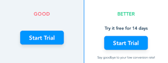
Here is an example of taking your free trial CTA to next level. A little information can create a huge difference in making you stand out amongst the competitors.
However, you can use free available saas website layout or get it designed by a designer. The later is the best option, as it gives you more flexibility when it comes to portray your brand’s image in the market and among the customers.
Even The Best Saas Webs Design Templates Can Fail?
Look out for the mistakes, if not something else.
As much as building a SaaS website contribute to selling your products, as much it is important to stand out among your competitors. Therefore, some factors in relation to your products must be taken care of. For instance;
- Customer support
- People behind the brand
- Security
Solely putting all the attention and effort on the website designing can also lead you to a dead end. Customers tend to enjoy the good services, but never speak about it more. Whenever the service is discussed the poor one has been the one.
Are you in the middle somewhere?
There are only the two extremes when it comes to services offered by any company. The excellent one and the poor one. Customers may not remember or discuss the mediocre because they are just satisfied with what they are getting. The only target websites are the ones that are poor.
Keeping that in mind, you need to make sure not to get in the poor category. That is to say, incorporate good will to your brand and amongst the customers.
Services & Team
The best practice considering customer service and team behind the business includes;
- Add testimonials to your website.
- Make sure to introduce the hardworking team behind the business.
- Always give customers the freedom to contact you whenever they want. Moreover, be present.
- Sharing service certificates and awards if you have any is not a bad idea.
Be proud of making it to the top.
Security
SaaS companies are responsible for keeping sensitive information that belong to organizations and people. People deserve and will surely want to know that their information is safe and secure .
alt=”web design wordpress”hough, customers do not need to be aware of every detail; they only need to be aware of the fundamental concepts and technologies that are in place to ensure the security of their data.
Wrapping it up!
Knowing that in today’s world everything is fast paced and people have very short time on hand for anything. However, you have the ability to make their lives and jobs more convenient with your products and services. Your website being a natural extension of your product, and it is the first thing that customers will see – and you have to make them stay.
First impressions are important, as are the expectations that people have of your brand, among other things. With straightforward copy and thoughtful design, you can begin to consider their journey and foresee their questions. Consequently, using them to your benefit and keep upgrading your SaaS website design for the good.


