Web design is one of the important aspects that directly contributes to the ranking or popularity of a website. You may not know web design is more critical than you can comprehend. Website, being the first thing that represents your business decides the success. Therefore, using some great conversion tactics only is not enough.
AN EFFECTIVE WEB DESIGN; KEY FACTORS
Most certainly, an effective web design must not miss out on any factor that works as a catalyst in taking your conversions to the sky. For instance;
- Your web design must fulfil its intended purpose. That is to say, it must convey the right message.
- It must keep your audience engaged from the very first moment.
- Your website must depict an element of trust.
- There is no chance that you can overlook user experience when it comes to website design.
- It must build a good reputation amongst competitors.
Website design done right is not just about the layout or the colours. Most certainly, the combination of various elements in the right manner and ratio is the secret ingredient.
ELEMENTS OF WEB DESIGN
Speaking of the fundamentals, there are four basic elements that collectively improve the overall user experience. Hence, every element holds equal weightage when it comes to designing an effective website.
If you are thinking of designing a new website or want to upgrade an existing one, you can follow these steps to create a good website design that fulfils the very purpose.
4 Elements Of An Effective Web Design
Let’s have a look at four elements of an effective web design;
- Aesthetic
- Usability
- Visibility
- Content
AESTHETICS
Colour
Colour deliberately is essential in web design; colours, often at an unconscious level, generate message and emotion. Hence, you can carefully use them to communicate a word and create brand identification.
The selection of colors in website design is more than just aesthetics.
Therefore, it is vital to implement the colour theory, psychology and harmony to build an efficient colour palette that matches the values, message, and market target of your brand.
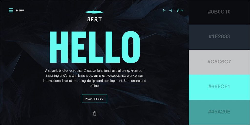
The best color practices for web designing
- Pay keen attention to cultural context.
- Understand the color theory.
- Make proper use of primary, secondary, tertiary colors along with shades and tint.
- Make use of contrast.
Firstly, the best approach to choosing the colours is defining a pallet for your business that grabs that vision of the business. Secondly, it must align with other elements and content on the site. Thirdly, and the most important is to make sure that you are not trading target audience psychological needs for your business.
Typography
Consistency and coherence!
Speaking in terms of a good web design using the right approach to typography significantly helps in making your website look aesthetically pleasing. Furthermore, it improves the user experience and makes your content attractive, which enhances the readability.
That is to say, almost 90% of your website consist of typography. While giving the right information, it is important to put things right.
Basic elements of typography
- Context: Despite the number of fonts and styles available, it is crucial to choose the one that matches the context of your business and website. For example; a beauty brand and a law firm cannot use the same typeface.
As a company, you need to decide what image you want to build and go along with that.
- Quantity of typeface: using the right number of typefaces is as important as the choice of fonts. In other words, using too much or too little typeface can distract the visitors from the main content.
There is no rule of thumb to go for the number of typefaces. However, 2 to 4 is an ideal choice. Using the same typeface for the whole website helps in building consistency throughout. Furthermore, you build a trademark for the brand.
- Size of the font: people usually sit 20 to 22 inches away from the screen, which calls for the legibility of the text. If the employed fonts are incomprehensible or small, and the visitor must zoom in to view the material, it certainly impacts the user experience negatively.
- Text weightage; By altering the weight of the words to be highlighted on the website, you can improve the readability of your website. It’s preferable to grab attention than with different typefaces, by giving weight to the keywords. If desired, the same fonts will make the information look cleaner and more accurate.
Mextures
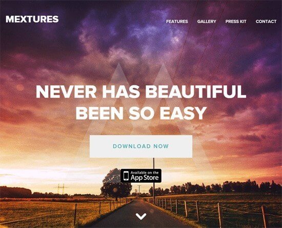
Mextures has used the typography in the most perfect manner. From the font size to weighing the information with different sizes, it highlights the main idea of the website.
Curt’s Special Recipe
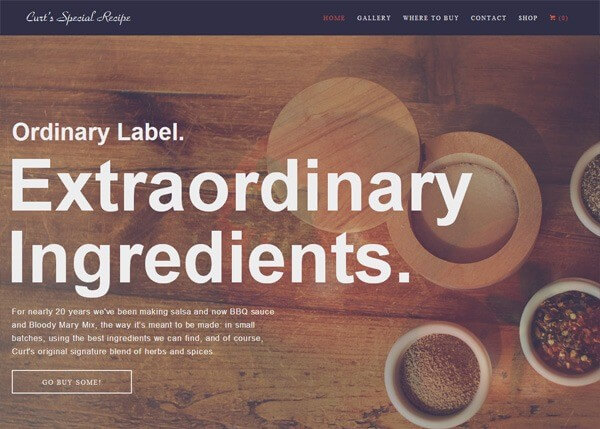
Using the least colours, “Curt’s Special Recipe” makes its business vision clear and easily impacting. That is to say, they have highlighted their best service with a bigger font. Moreover, the number of typefaces is limited, yet impressive.
Visual Hierarchy
The focus of the visual design is on the aesthetic aspects of a site and its associated contents, using images, colours, fonts and other features strategically. However, a successful web design must not trade useful information. It helps in creating brand confidence and interest.
Basic elements of visual design
The visual hierarchy gives you the sense of using all the elements together in harmony. While figuring out what and how’s of a website design, you must not overlook these basic principles.
- Unity; is a relation of all the parts of the site to each other. In order to avoid a poor or overwhelming design, visual design should strike the balance between unity and variation.
- Gestalt; refers to how a human eye perceives various elements on the screen. therefore, it keeps the focus on how visitors perceive the whole design rather than focusing on one factor.
- Space; is “defined if something is placed therein.” therefore, using space rightly into a design directly contributes to noise reduction, readability or illusion.
- Hierarchy; highlights the distinction between items in importance. Often designers construct hierarchies through various font sizes, colours, and page layout. In general, the most significant elements are perceived near the top.
- Balance; gives the idea that equal distribution exists. This doesn’t always mean that symmetry exists.
- Contrast; focuses on creating a distinction between the element. This can be achieved with the use of highlights, colours, and sizes of the text, visuals, and other elements.
- Scale; specifies a range of dimensions; it generates interest and depth by showing how each item is related by size.
Garoa Skincare
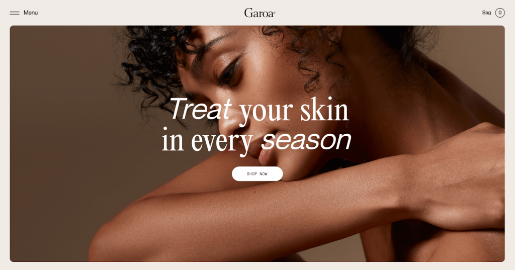
The Gaora has incorporated some high-quality graphics, complementing typefaces, and balanced negative space with a relevant copy to their web design. It does not only keep visitor’s focus on the main information but also helps in giving a simple yet luxurious experience.
USABILITY
Keeping the user priority, you must consider website usability when it comes to designing a successful website. Therefore, the factors like page speed, device-specific design, and design convention must be created with keeping user intent in mind.
How long would you wait for the site to load before you go off?
The approach you need to focus on is by putting yourself in customers’ shoes. Here are some basic elements of usability for a better user experience.
Page Layout
“The whole is greater than the sum of its parts”, famously said by Aristotle – but it3 does not nullify the importance of each part that contribute to making the whole. The same applies to web design. Most importantly, while setting the layout.
Elements of page layout;
- Header & Menu; are the first things the user see. It must comprise the brand logo. Whereas, the menu gives users an overview of what they could find.
- Images; are the first thing you always see right below the header. There are two main reasons to use images; to create a work or service image and aesthetics.
- Content; is something you cannot miss out on. Therefore, how to place or distribute the content on the site is important. Using short buttons and images to categorise or display the content is a powerful driving factor for the visitors.
- Footer; is the bottom part of the website page. The use of footer varies as per the website or personal preference. Some sites use the footer to offer credentials and testimonials.
Best layouts for an effective website
That is to say, a layout is the arrangement of various visual or contextual elements on the web page, creating consistency.
Here are some most used and clean layouts for websites;
- F-pattern
- Z-pattern
- Split screen
- Box layout
- Symmetrical
- Column-based layouts
F-pattern is the most efficient in offering a neat and user-friendly outlook.
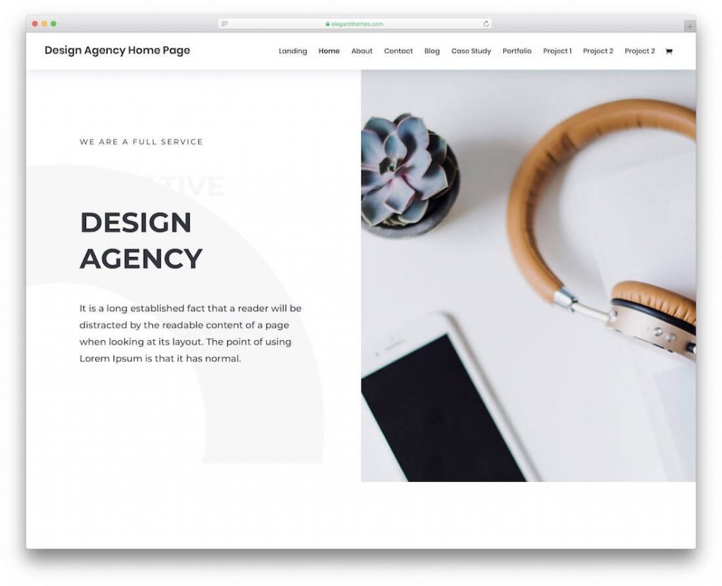
The grid layout gives a wider view in comparison to other layouts if used properly.
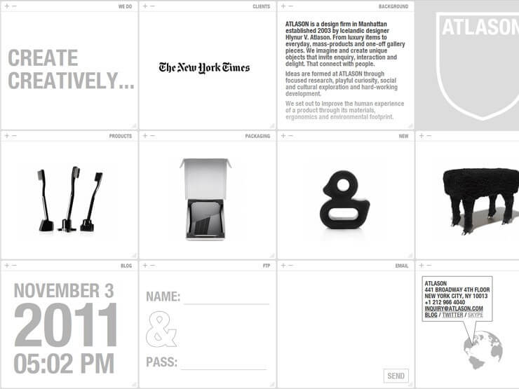
Home page and site navigation. Signpost directions for users.
Site search. Large sites need a sensibly positioned search option.
Form entry. Make forms as lightweight and easy to fill as possible.
Navigation
The only distance between the visitor becomes the customer!
However, navigation is the only thing that stands between the user and the purchase – and as the business or marketer, you have to shorten and simplify that distance via offering quick navigation.
You do not want your visitor to be stuck on the main page forever, right?
Why does navigation matter?
Keeping the market and the business perspective on top, navigation of website also directly contributes to the user-friendliness of a website. Therefore, your website’s navigation must fulfil certain requirements. For instance,
- Must enable users the shortest route.
- Offer a clear picture of where it leads to.
- Must match your users need to the website.
- Users must know where they are exactly and how to get back.
Elements of website navigation
To achieve the very purpose of website navigation, you must not overlook these essential components to get the best results.
- The current locator; is the ID that specifies where they are on the website and what path to follow. Therefore, you can use different colours, patterns or themes to represent the path.
- Navigation method; give users access to various sections of the content. That is to say, you must keep all the content in a hierarchy. For instance, if you are choosing a category, it must show sub-categories.
- Home link; also known as traceroute, effective navigation must show where exactly you are and how to go back to where you started from.
NKI
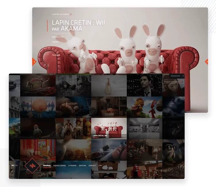
NKI comes up with a breathtaking navigational layout. It is grid-based and when you hover, it highlights the content. With their fixed menu at the left bottom, users never worry about being lost.
VISIBILITY
Get recognized!
One way or the other, the main purpose of a website is to be known as a brand and reach the right audience.
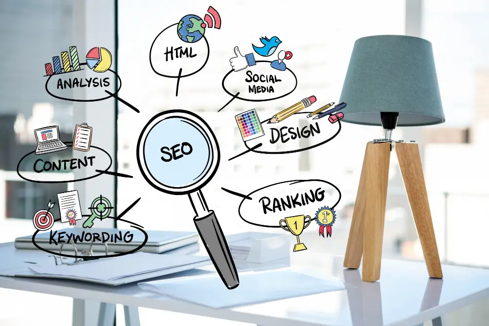
An SEO friendly site must be able to get noticed when a search engine crawls through the pages. Therefore, an SEO friendly site requires careful planning and a structured approach in the designing phase.
User experience
Firstly, you have to think from a user’s perspective. Secondly, know that people on the internet have no tolerance for poor user experience. That is to say, with a fast-paced digital world, the performance of your website speaks a lot about your business.
Load time
Visitors will leave a website if they have to wait for more or less 3 seconds for it to load.
Make sure your website loads quickly by reducing picture sizes and consolidating code into a single JavaScript or file to reduce the number of HTTP requests. Additionally, JavaScript and CSS should be compressed for faster loading times.
CMS
The content management system (CMS) that you choose for your website have a significant impact on its overall success or failure.
The use of WordPress is a fantastic alternative in many instances, but it is not the only option available. It is unquestionably set up at a fundamental level. that is to say, Google can easily understand it. Therefore, this is not to argue that besides being a great option in all circumstances, but a decent starting point for the majority of firms.
Furthermore, make sure that the content management system (CMS) you select is the best fit for your needs, rather than the one that your chosen web firm wants to use.
Mobile-friendly Web Design
Designing your website with a responsive layout is as important as other aspects.
A website’s design must be responsive to different screen sizes in order to take advantage of the ever-growing popularity of smartphones, tablets, and phablets. That is to say, your chances of losing the battle to increased digital compatibility are higher if your website design does not support all screen widths.
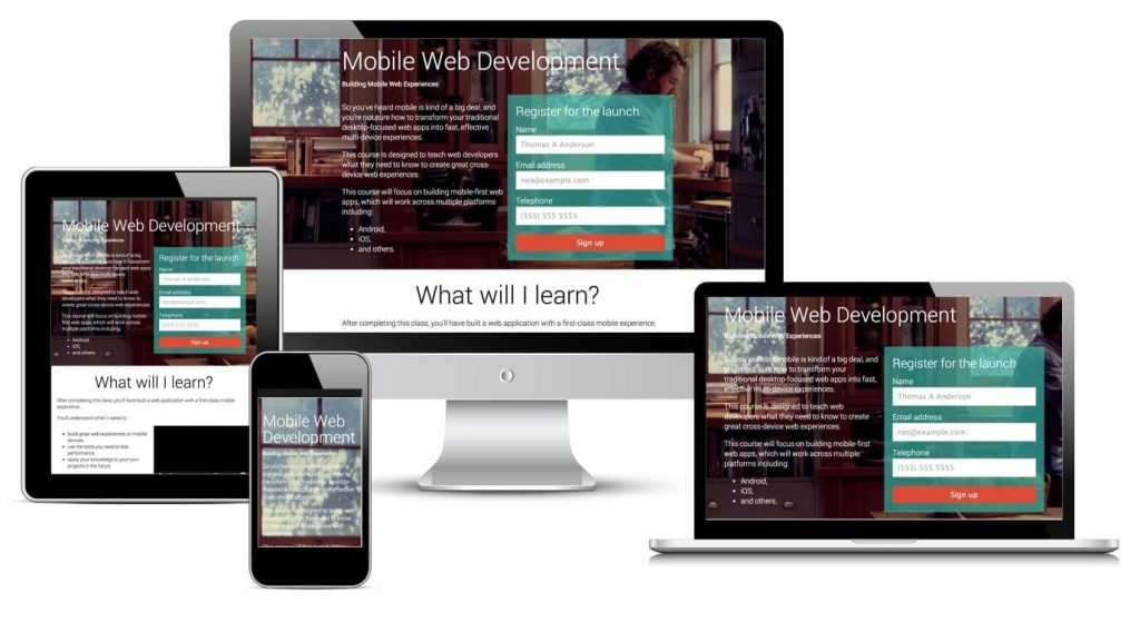
Incorporate some good website design ideas that instantly strike visitors attention and must make them stay. With your website design, make sure that you are portraying your business or an idea while hitting customer’s hurting points.
CONTENT
A combination of a great web design and great content is a total hit!
When we speak of content in a web design, it refers to the layout and placement of the text on the website.
From various approaches to placing content on the website, keeping a path is important. Once visitors land on the website, they must know where to find what. Sort your content into proper categories and sub-categories. The easier it will make it for the user to find what they are looking for, the longer they would stay.
Wrapping it up!
As there is no thumb of rule, yet some basic principles that you must not overlook while creating a website that meets website design trends as per today’s world.
Furthermore, not just the basic principles, personal preference like your target audience and essence of the brand comes into play while creating a good website.
Get more information by contacting us.
