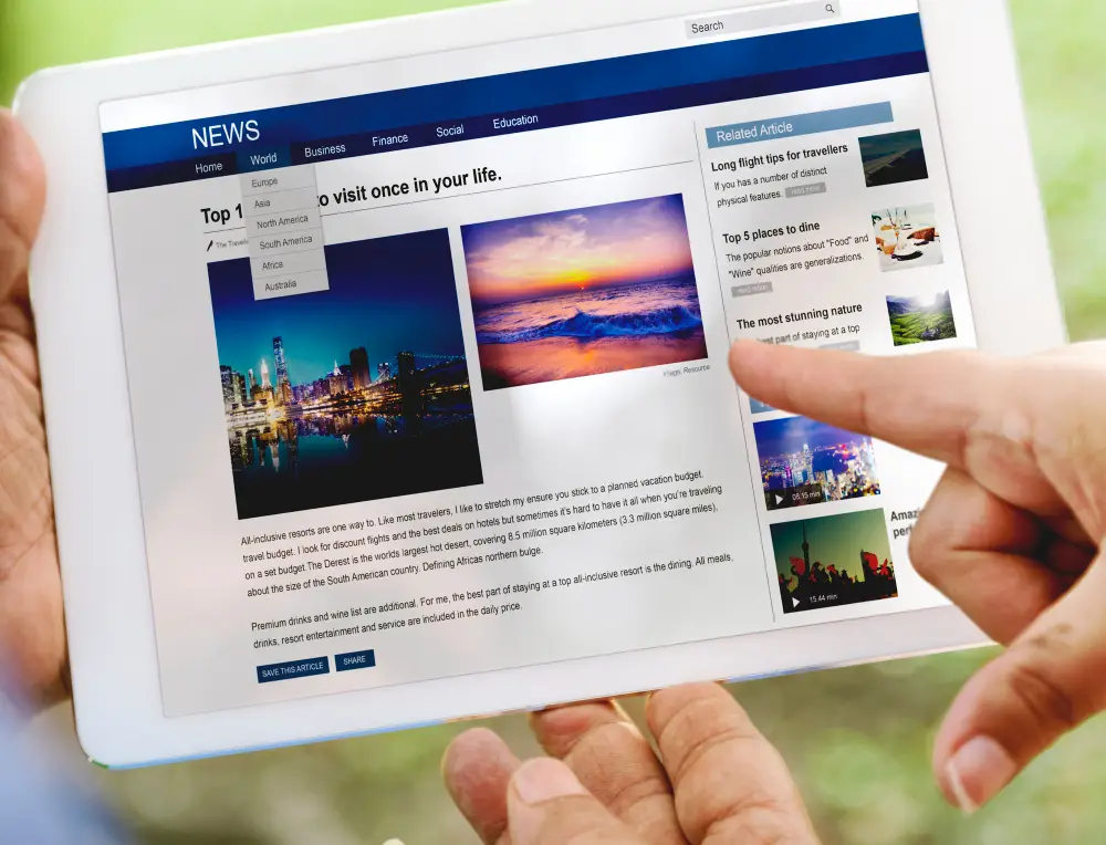
Web accessibility ensures that websites and web applications are usable by people with a wide range of abilities and disabilities. This includes individuals with visual, auditory, motor, and cognitive impairments. By designing with accessibility in mind, you not only comply with legal standards but also create better user experiences for all. Figma provides various tools and features that support accessibility-focused design.
Why Accessibility Matters
- Broader Audience: Making your website accessible allows you to reach a larger audience, including users with disabilities.
- Legal Compliance: Many regions have legal requirements for web accessibility, such as the Americans with Disabilities Act (ADA) and the Web Content Accessibility Guidelines (WCAG).
- Improved Usability: Accessibility features often enhance the overall usability of your site, benefiting all users.
- Ethical Responsibility: Designing for accessibility is part of creating an inclusive and equitable digital environment.
Key Principles of Accessible Design
Before diving into specific tips for using Figma, it’s important to understand the core principles of accessible design:
- Perceivable: Information and user interface components must be presented in ways that users can perceive.
- Operable: User interface components and navigation must be operable by all users.
- Understandable: Information and the operation of the user interface must be understandable.
- Robust: Content must be robust enough to be interpreted reliably by a wide variety of user agents, including assistive technologies.
Using Figma to Design Accessible Web Experiences
1. Color Contrast and Readability

Ensure that text and important visual elements have sufficient contrast against their backgrounds:
- Contrast Checker: Use Figma plugins like Stark to check color contrast ratios and ensure they meet WCAG standards.
- Text Size and Weight: Use adequate font sizes and weights to ensure readability. Avoid using light or thin fonts on dark backgrounds.
- Color Blindness: Use tools to simulate color blindness and ensure your design is perceivable by users with color vision deficiencies.
2. Semantic Structure and Navigation

Create a logical structure and navigation to help users understand and navigate your site:
- Headings and Labels: Use proper headings (H1, H2, etc.) and labels to create a clear hierarchy. This helps screen readers and improves usability.
- Landmark Roles: Designate areas of your page (e.g., header, main content, footer) with appropriate landmark roles to aid navigation.
- Focus Indicators: Ensure that interactive elements (buttons, links) have clear focus indicators for keyboard navigation.
3. Interactive Elements

Design interactive elements to be accessible and easy to use:
- Button Size and Spacing: Make buttons and touch targets large enough to be easily clickable. Use adequate spacing to prevent accidental clicks.
- Keyboard Navigation: Ensure that all interactive elements can be navigated and activated using a keyboard.
- Descriptive Links: Use descriptive text for links and buttons to clearly indicate their purpose (e.g., “Read More About Our Services” instead of “Click Here”).
4. Images and Media

Provide accessible alternatives for images and media content:
- Alt Text: Add meaningful alt text descriptions to images to convey information to users who rely on screen readers.
- Captions and Transcripts: Provide captions for videos and transcripts for audio content to make them accessible to users with hearing impairments.
- Avoid Text in Images: Refrain from embedding text within images. If necessary, ensure the same information is available as accessible text.
5. Form Accessibility

Design forms to be accessible and easy to navigate:
- Labels and Instructions: Provide clear labels and instructions for all form fields. Use placeholder text to supplement labels, not replace them.
- Error Messages: Ensure error messages are clear, specific, and accessible. Highlight the field with the error and provide instructions to correct it.
- Field Focus: Ensure that focus moves logically through form fields and that users can navigate and submit forms using a keyboard.
Best Practices for Inclusive Design with Figma
Utilize Figma Plugins
Enhance your accessibility workflow with Figma plugins:
- Stark: Check color contrast and simulate color blindness.
- Able: Evaluate the accessibility of your designs against WCAG guidelines.
- Contrast: Quickly check contrast ratios between text and background colors.
Conduct User Testing
- Inclusive Testing: Include users with disabilities in your testing process to gather feedback on accessibility.
- Assistive Technologies: Test your designs with screen readers, keyboard navigation, and other assistive technologies to ensure they are fully accessible.
Continuous Learning and Improvement
- Stay Updated: Keep up with the latest accessibility guidelines and best practices.
- Iterate and Improve: Regularly review and update your designs to improve accessibility based on user feedback and testing results.
Conclusion
Designing for accessibility is essential for creating inclusive web experiences that serve all users effectively. By leveraging Figma’s tools and features, you can incorporate accessibility into your design process and ensure your website is usable by everyone. Prioritizing accessibility not only broadens your audience and complies with legal requirements but also enhances the overall user experience. Embrace these tips and best practices to create accessible and inclusive web designs with Figma.


