This is what I did not ask for?
Well, the first and foremost step towards building a high conversion landing page, you need to know what your target audience is demanding.
YOU MAY ASK; WHAT IS A LANDING PAGE?
As the name says, it is the first page the visitors are redirected to when they hit your promotional gig; an ad, a banner or any other promotional medium, like an email. Its sole purpose is not to just bring traffic to the page, but to convert it into customers or buyers.
Landing page vs home page
The most common misconception regarding landing pages is people assuming their home as the only landing page, which it clearly is not.
Any page on your website that creates a particular campaign, any sale, or represents the product or services is known as a landing page. It can be any page on your website.
Some pages are created to send out information, while others work as a getaway to the site. The sole and the most important purpose of a landing page is to convert.
Your homepage can be your landing page, but the landing page cannot always be your home page.
Here is an example of a home page that offers a call-to-action to its customers. It may not lead them to another page, but as the customer signs up or register, they will be using the services offered. Hence, conversion.
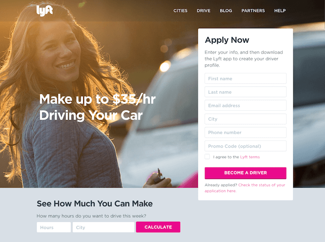
If you are looking for a landing page template to go, wait. There is no guarantee that if one landing page layout is working good for one business, it will work the same for you.
HOW TO BUILD A HIGH CONVERTING LANDING PAGE
The right approach and the right tools are what you need to increase conversion from your page.
We will be learning the simplest and the easiest ways to create a high conversion page, without investing additional bucks.
Getting started
Before jumping directly on to the landing page layout and design, it is important to have a vision set for yourself, keeping the target audience priority.
Determine Your Goal
Just as we discussed earlier, every page comes with its purpose. First of all, you need to set your goal for the landing page.
⦁ If you are looking to grow your email list?
⦁ Are you promoting a product or service?
⦁ Any deals or discounts are going on?
Get on with your keyword research
Secondly, you must target your audience with the words that common people type in while searching for something – keywords.
Thirdly, once you are done with your goal and keywords, it is time to get your hands dirty – build an effective, high conversion landing page.
ESSENTIAL ELEMENTS OF A LANDING PAGE
Let’s have a look at the most crucial elements that every high conversion landing page must-have.
1. A Pitch-Perfect Headline
This is where it all begins – a headline.
To attract the target audience, you must put a headline that drives the interest of the customer – something attention-grabbing.
Understand, what makes you stay on any website, and bring it to execution.
Your headline must accomplish certain parameters, such as;
⦁ It must grab the attention of the visitor.
⦁ What you are offering?
⦁ K.I.S.S; “keep it simple, stupid.” make sure the headline is not more than 20 words to perfection or else you can go to 20 words.
Example 1: Slack
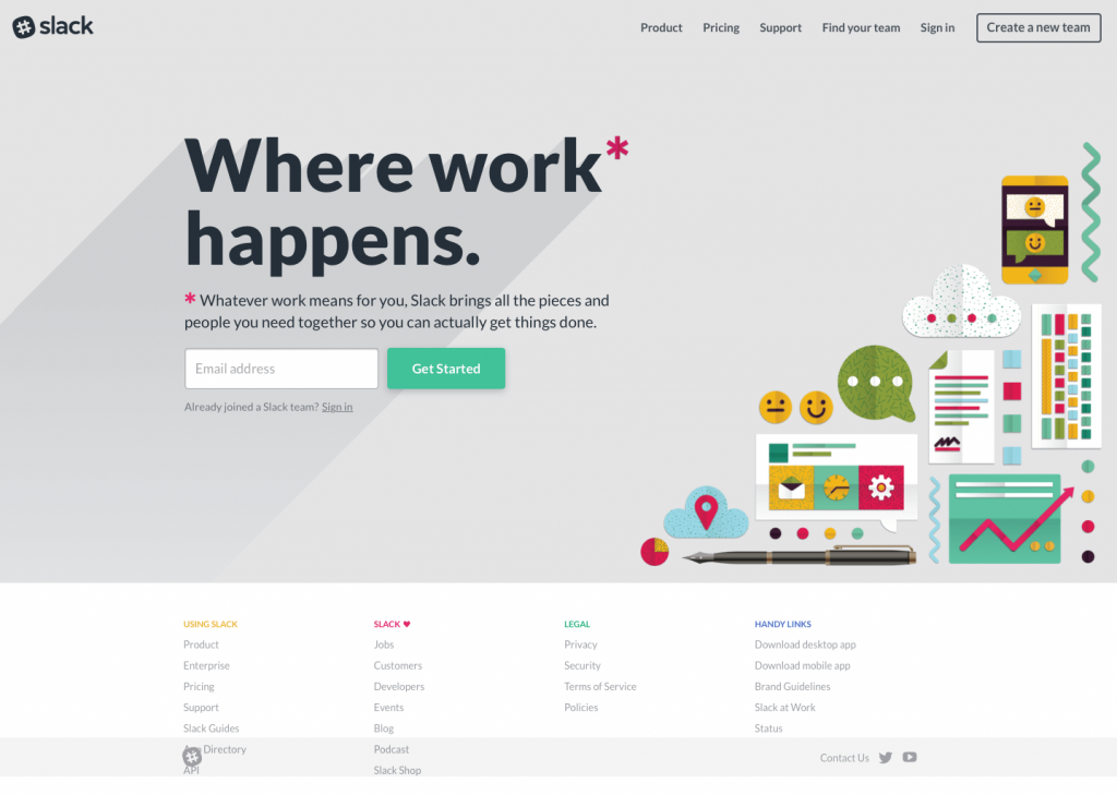
Headline;
We have an intriguing headline that explains the purpose of the service.
⦁ Short and simple
⦁ To the point
⦁ Specifies a service related to work
Example 2: Lobe AI software
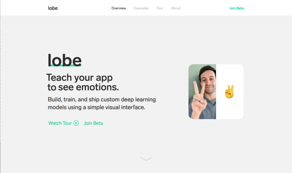
Headline;
The headline is 6 words long, less than 10, which makes it perfect.
⦁ It is to the point
⦁ Clearly states what the product or service is about.
⦁ The visitor will get an idea or will stick to your page or may click to learn more about the product/service.
Example 3:
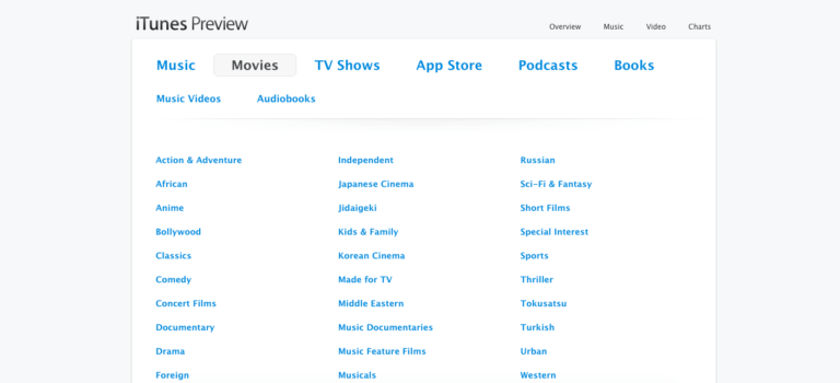
Headline;
Well, this will give you a shock for a moment. Coming from a big company, if you search for “iTunes movies”, this is the first result on google.
⦁ It cannot even be called a landing page, vague.
⦁ Does not have a motto, vision or statement.
⦁ It contains so many call-to-action buttons, which is downright confusing or not interesting.
A landing page must have an intriguing layout with some colour psychology implemented – or else if you are offering way too many clicks, visitors will get bored.
You have to grab their attention for the good.
2. Do not overlook sub-headings
Now comes the sub-heading. It is as important for a landing page as a headline, especially if you are going classy, fun or quirky with your heading – visitors need to know what the deal is about.
To put it into the simplest of the words, if your heading grabs their attention, your landing page subheading must make them stay.
Keep in mind while curating sib-headings;
⦁ Place it directly underneath the headline, visitor must see the subheading when they have a look at the headline.
⦁ It must spark curiosity in the reader.
⦁ The subheading has to explain your headline further.
⦁ The subheading not necessarily has to depict the most compelling element of the page.
Example 1: Slack
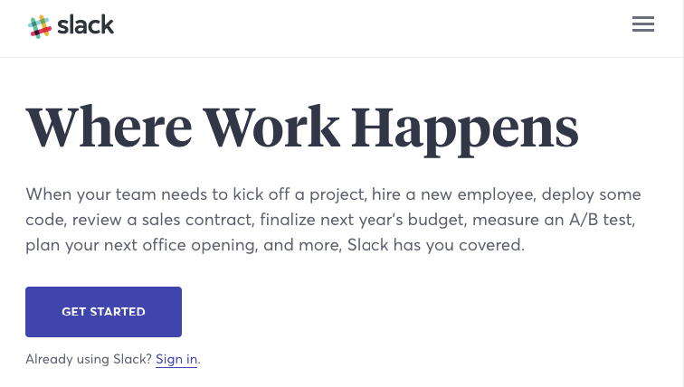
Subheading;
⦁ As clear as the heading is, the subheading gives readers how the platform work.
⦁ It offers visitors some of the benefits they can get from the service.
⦁ In contrast to an effective headline and the subheadline, both separately do the job perfectly fine.
Example 2:Email list builder (course)
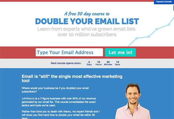
Subheadline;
Well, here the headline and the subheadline are inverted.
⦁ Subheadline is placed above the headline in this example, though it states the services or product offered, which is a 30-day course.
⦁ For laymen, it can be a little confusing in a way; they may take it as a service that makes an email list for them – which it does not.
3. Visual, visuals.
Being an important part of a landing page, visual information is not only more appealing but also enhances learning quicker.
Our brain tends to process images almost 60,000 times faster than the text, which is a steal for an effective landing page.
Having the benefit of the doubt, you can use visual information, captivating images on your landing page – but do not forget that “the right placement” matters the most.
Before adding some images to your landing page, understand how to do it;
⦁ The image must be large, clear, and informative.
⦁ It must relate to your product or service.
⦁ For physical entities, the image must show your product.
⦁ If you are selling a service, go for the images that visualize the primary purpose of what you are offering.
⦁ Your image must be high-quality.
It is all about giving out information, with the least text.
Example: UBER
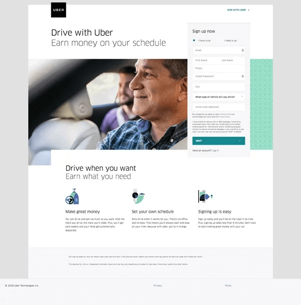
Image presentation;
A comfortable, homely, and impression leaving visual presentation.
⦁ This example gives a potential sense of user-friendliness.
⦁ The image is high quality and clean.
⦁ The image and the headline are separate and clean.
The neater you go with your landing page, the more impact it would leave.
Landing Page Image Basics
Colour being a powerful medium for communication can be used to influence the mood of the visitors. For instance, in a room painted bright orange, you may feel agitated, in contrast to a room painted in blue, peaceful and calm.
As per the study, 90% of customer’s decision is based particularly on the product colours. That is to say, aesthetics play an important role in customer purchase decisions.
Here are some of the basics to choose the colours and images in creating an impression leaving the landing page.
⦁ The right background colour; use of solid colours that do not interfere with the text at the front. Try to have a contrast between the background and the front content. For instance, dark background with lighter text or vice versa.
⦁ Go minimalistic; with a plain background, you can achieve a high conversion landing page, having striking text at the front.
⦁ Call-to-action colours; well, it may sound a little petty, but having an inspiring call to action buttons can elevate or lower down customers’ decision mood. For instance, pink gives out a feeling of love, whereas, orange spread the warmth. On the other hand, blue is a colour of trust.
Note that not any particular colour is the right one for the high conversion landing page. That is to say, the founder of Conversion XL states, “there is NO best colour for increasing conversion”.
Not to discourage you, it all depends on the blend of the right colour with other elements of a high conversion landing page.
4. Go straightforward with an explanation
Well, you have all the other pages for stories.
Your landing page must offer a clear image of customers’ benefits. Make it solely keeping customers’ intent in mind.
While choosing what you want to put in the explanation part of your landing page, here are some points to keep in mind;
⦁ The explanation part of the landing page must correlate to your headline or subheadline.
⦁ It must speak volumes of user intent.
⦁ The explanation must be functional and give something answers to customers’ requirements.
For an effective landing page that genuinely generates conversion, going straightforward with every element is your front-runner.
5. Invoke Pain
Let alone headline or visuals, you need to create a need in customers’ life. Let them know that the product or service you are offering is what they lack.
Human psychology works a certain way; they tend to avoid the pain, and once they encounter some, they always try to alleviate it in one way or the other – and they do not rest until they find some relief from the pain.
Hit on the nerve, stick in their mind, haunt them or whatnot – stay.
It may sound evil, but hey, in a good way.
Here are some tips to accomplish customers’ ultimate attention with your landing page elements;
⦁ What they lack; not just tell them what they will get from you, but emphasize what they will lack. It’s a little tricky, but if you are good with words, it’s a no-brainer.
⦁ Loss aversion theory; the pain of losing something of equal value to the joy of gaining something, which gives you the benefit of doing your magic.
⦁ Testimonials all the way; to concise, add testimonials in your copy. Using the human element of pain, convey the visitors’ on your page with real-life experiences.
Last but not the least, do not forget that you are here to relieve the pain. It is a cycle of creating the need and then offering solutions to that need.
Example:
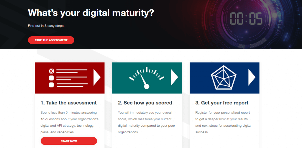
In the world of SEO and content, digital maturity is a pain point, especially for newbies.
They want to do it all and do it right.
This example is a perfect depiction of invoking the need of customers in different ways. For instance;
⦁ The challenge in the field.
⦁The need for digital maturity.
⦁ Above all, it gives you the itch to know how well you are doing with your hustle.
⦁ Let alone invoking pain, this example has the word “free report” – which instantly compel the visitor’s to click no matter what.
Similarly, many of us face trouble meeting the standards. By highlighting the issue and then offering a solution, you have got it all covered.
Nothing at the end, you still have your email list built. Right?
6. Pay for the pain
As much as we humans avoid pain, they are in constant search of pleasure in various forms. The best way to achieve a high conversion landing page is to incorporate the element of pleasure in your landing page.
Depending on your personal preference, you can use it for your good by;
⦁ Letting customers know what emotional relief or peace of mind they can have using your product or service.
⦁ Showing how your product can correspond to their emotional needs.
⦁ Align with the customers’ on deeper levels – show them what lies underneath.
Trust me, we humans love to find a connection in everything.
Create the connection. Be real.
For instance, if you are selling a coffee machine – it is not just about that, you are making their morning or evenings better, fun, and fulfilling.
7. How Legitimate Are You?
For a smooth conversion funnel, there is a long list of ways, but choosing the one that gives the sense of knowing is the most effective.
Some of the most popular and authentic pages you may have visited offer email, contact number or customer service pop-up, which are all good in building trust.
To build trust amongst the challenging market, here are some pain points you must consider. For instance;
⦁ Put yourself in customers’ shoes for this one. Understand what way of communication gives you the most sense of security and authority.
⦁ Give out an image of a legitimate business, profile or company. People love that! Using a physical address or contact number are weighed above email.
⦁ Make sure that the pop-up is not blocking essential elements of the landing page. Guh! A major turn off, frustrating and distracting.
Example; chaport
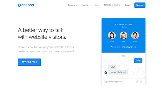
This landing page live chat pop-up is not just a simple one, but it also is giving you an in-person experience by showing who you are talking to – or it is not just a bot.
This is not a must-have, but beneficial. However, some landing page customer support pop-ups are capable enough to understand if you are a new visitor or have been here not for the first time.
Well, whatever suits you as per your personal preference or how willing you are to invest in customer support. This is a game of increasing your chances to stand amongst all.
8. Add An Element Of Surety
Hopping back to human psychology, we love to have security in whatever we intend to do.
Costing you nothing, you can add an element of reassurance on your landing page to make your visitors stay – not just stay, but purchase.
Give something that others with a similar product or service are not offering.
9. Call-to-action
This is your key to a successful high converting landing page.
Wrapping every element into one, a powerful call-to-action makes its way to the top. This one click is what your whole landing page content revolves around – converting visitors into customers.
Let’s peek into must-have CTA (call-to-action);
⦁ Bigger the better.
⦁ Go for interactive words, invoking, exciting, and above all persuasive.
⦁ Move on with the trend and use a button for your call to action.
⦁ Stand out with colours.
Example; Netflix
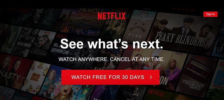
Netflix knows it all.
⦁ They have incorporated a power word into their CTA, which instantly grab customers’ attention.
⦁ It perfectly has created a contrast to the background. Not a solid colour, but still, the CTA is standing out.
Let’s quickly wrap it up, by considering the placement of other elements in this landing page example.
Headline;
⦁ Intriguing
⦁ Invoke curiosity
⦁ Big and clear
Subheadline;
⦁ Gives a sense of relief with “cancel at any time”.
⦁ Offers the freedom of getting your hands on your favourite show, literally anywhere.
Call-to-action;
⦁ Persuading
⦁ Use of power word, “free”.
⦁ High contrast with the background
Conclusion
Well, there is no rule of thumb for a high conversion landing page. Though, keeping your target audience and the product or services you are offering priority, you can mix and match different elements on your landing page. For instance, no one would like to get in a conversation with NetFlix live support – so it does not need a live chat pop-up.
However, a company that offers marketing services may come across numerous queries. Following the best landing page practices, you can stand out amongst the competitors.
We can find a lot of WordPress landing page options to choose from and customize them accordingly if you do not want to start from scratch. Again, it is not about just one go-to method or rule.
So, you have to mix the elements accordingly to create a landing page that converts visitors into customers.
Get more information by contacting us.
