

In today’s digital age, having a responsive website is not just a luxury—it’s a necessity. With more people accessing the internet via smartphones and tablets, ensuring your website looks and functions well on all devices is crucial. Visual Composer, a powerful WordPress page builder, provides the tools you need to create beautiful, responsive designs without touching a line of code.
Why Choose Visual Composer?
Visual Composer stands out among page builders for several reasons:
- User-Friendly Interface: Its drag-and-drop interface makes it accessible for users of all skill levels.
- Versatility: It offers a wide range of design elements and templates.
- Responsive Design: Built-in responsiveness ensures your site looks great on any device.
- SEO-Friendly: Clean code and compatibility with SEO plugins help boost your site’s search engine rankings.
Getting Started with Visual Composer
Installing Visual Composer
To start, you need to install and activate the Visual Composer plugin on your WordPress site. Follow these steps:
- Purchase and Download: Visit the Visual Composer website, purchase the plugin, and download the zip file.
- Upload and Install: Go to your WordPress dashboard, navigate to Plugins > Add New, and upload the zip file. Click “Install Now” and then “Activate”.
- License Activation: Enter your license key to unlock all features and updates.
Exploring the Interface
Once activated, you’ll notice a new Visual Composer tab in your WordPress dashboard. Here, you can manage your templates, access the Hub for additional elements, and start building your pages.
Creating Your First Page
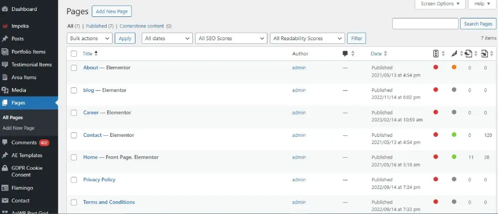
- Create a New Page: Navigate to Pages > Add New.
- Launch Visual Composer: Click the “Edit with Visual Composer” button.
- Choose a Layout: Start with a blank page or select a pre-designed template.
- Add Elements: Use the drag-and-drop editor to add and arrange elements like text blocks, images, videos, and more.
Designing for Responsiveness
Responsive design ensures your website looks great on all devices. Here’s how to achieve it with Visual Composer:
Utilizing Grid Layouts
Visual Composer’s grid layout system allows you to create flexible, responsive designs. Use rows and columns to structure your content, and adjust their settings for different screen sizes.
Customizing Responsive Settings
- Row and Column Settings: Click on any row or column, then adjust the settings for various devices. You can set different widths, padding, and margins for desktops, tablets, and mobiles.
- Hide/Show Elements: Control which elements appear on specific devices by using the “Hide on device” option in the element settings.
Previewing Your Design
Visual Composer lets you preview your design on different devices. Click the device icons (desktop, tablet, mobile) in the editor to see how your site looks and make adjustments accordingly.
Advanced Tips and Tricks
Using Visual Composer Hub

The Visual Composer Hub is a treasure trove of additional design elements, templates, and extensions. Here’s how to make the most of it:
- Accessing the Hub: Click the “Hub” button in the Visual Composer interface.
- Downloading Elements: Browse and download new elements, templates, and add-ons to enhance your site.
- Updating Content: Regularly check the Hub for new updates and content to keep your site fresh.
Custom CSS and JavaScript

For those with coding skills, Visual Composer allows you to add custom CSS and JavaScript to fine-tune your design:
- Custom CSS: Go to the Visual Composer settings and enter your custom CSS in the designated area.
- JavaScript: Add custom scripts to specific elements through the element’s settings.
Integrating with SEO Plugins
Visual Composer integrates seamlessly with popular SEO plugins like Yoast SEO and All in One SEO Pack. This ensures your site not only looks great but also performs well in search engine rankings.
Conclusion
Visual Composer is a powerful tool that simplifies the process of creating responsive WordPress designs. Its intuitive interface, combined with a wealth of features, makes it an excellent choice for beginners and experienced developers alike. By following this guide, you can harness the full potential of Visual Composer to build stunning, responsive websites that captivate your audience and boost your online presence.
Embrace the power of Visual Composer today and take your WordPress design skills to the next level.